From a family of software developers, I chose to focus on design.
With 18 years of experience, I operate across the full digital product lifecycle, driving outcomes that balance user needs, technical feasibility, and long-term business value.
I have partnered with executive stakeholders and cross-functional teams in both high-growth startups and large global organizations, contributing to products and platforms for brands such as Samsung, Nokia, HP, Michelin, and LG.
Fluent in English, Spanish, and Portuguese, enabling collaboration across the core linguistic markets of the Americas and beyond.
2025. Designed and coded from scratch by me using AI.
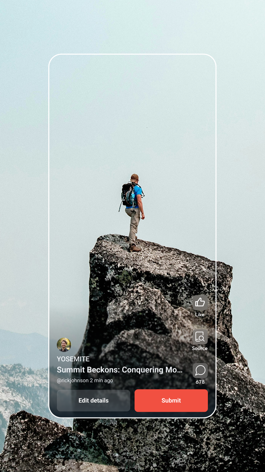
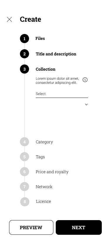
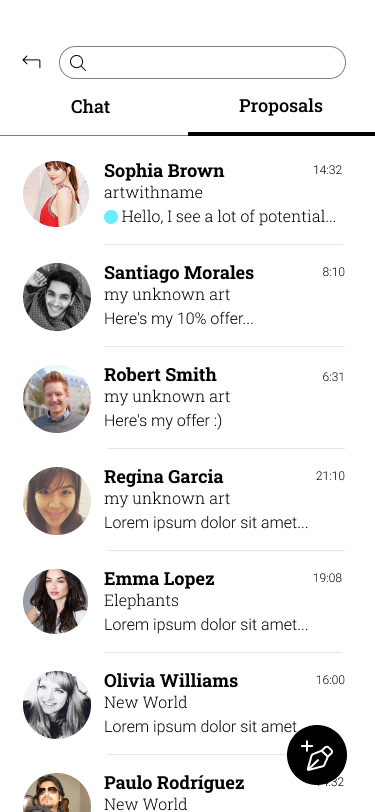
Case Study · Bloop
5-Day Prototype: Art Marketplace App
Role
Facilitator, Product Designer
Team
Founder, Product Designer
PROBLEM
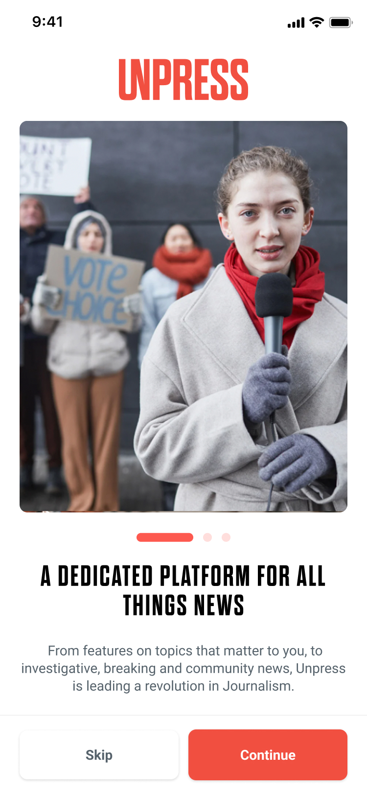
Unpress is an Austin-based journalism platform spearheaded by media leaders from CNN, NBC, and Gawker Media.
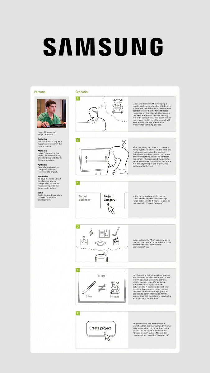
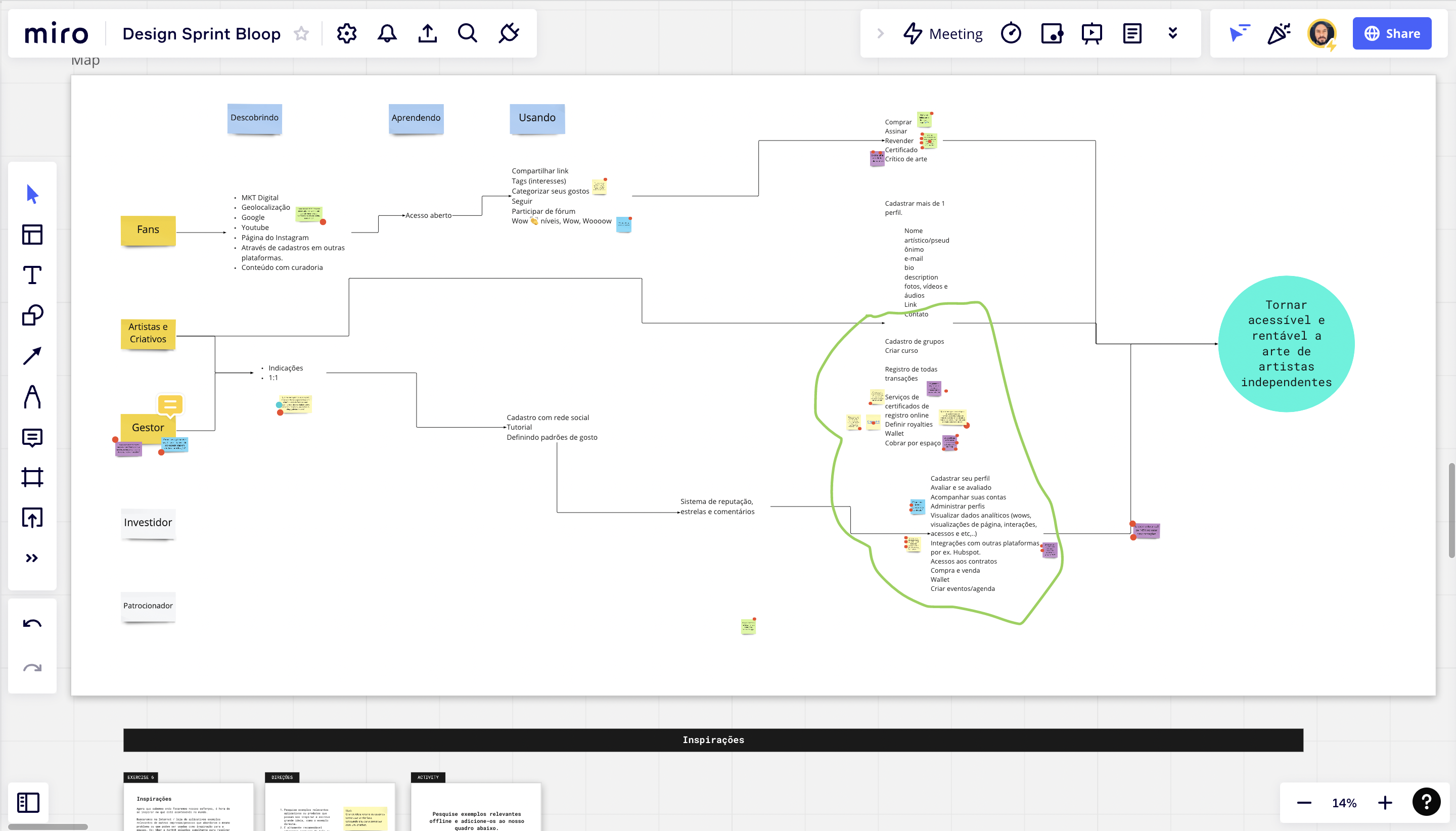
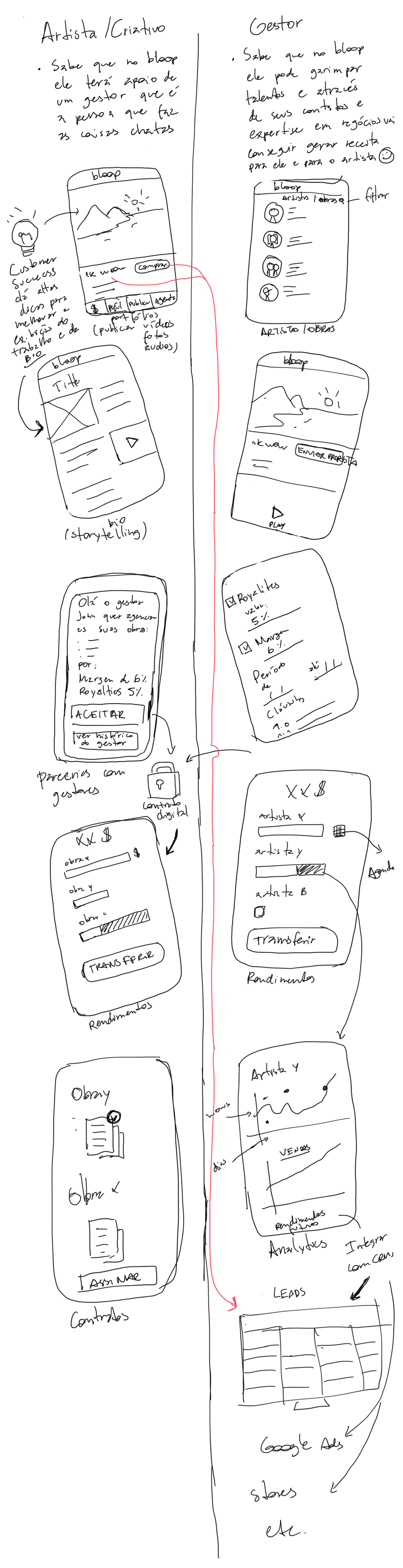
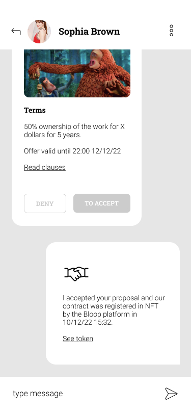
Using a Design Sprint, I mapped core user flows and simplified the journey for artists. We also created the brand identity in this time. We focused on critical pain points like pricing and publishing complexity, delivering a high-fidelity prototype in just 5 days that secured stakeholder buy-in.
Artists struggled with pricing and publishing complexity, creating friction in the first experience and reducing confidence in the product before launch.
SOLUTION
RESULTS
5 DaysTime to Market
100%Stakeholder Buy-in
"Stakeholders aligned quickly around the sprint outcome, and the prototype gave the team confidence to move forward."
The pandemic forced the Conquer Business School to migrate from in-person to online overnight. Speed was critical for survival. We needed to launch recorded courses immediately, but the existing legacy system and brand didn't represent this new digital-first era.
I redesigned websites and platforms to support this massive scale. The result was a robust digital ecosystem that handled the surge of over 2 million new students. This successful pivot positioned the company for its acquisition by the Wiser Group.
The organization needed to migrate from in-person learning to digital delivery at scale, but the legacy platform and brand were not ready for a digital-first experience.
SOLUTION
RESULTS
+100Screens Designed
+2MNewly Enrolled Students.
Case Study · Materialize
Fixing Rage Clicks to Increase Bookings
Role
UX Researcher
Team
Customer Success Manager
PROBLEM
Founded in 2019, Materialize was accelerated by Endeavor Scale-Up and backed by investors to scale. It operated as a B2B startup where companies bought hour credits to book video calls, while payments, validations, ratings and dispute handling maintained trust and quality. In 2025, the company surpassed half a million bookings. As a marketplace, customer trust depends on a strong feedback loop after key sessions.
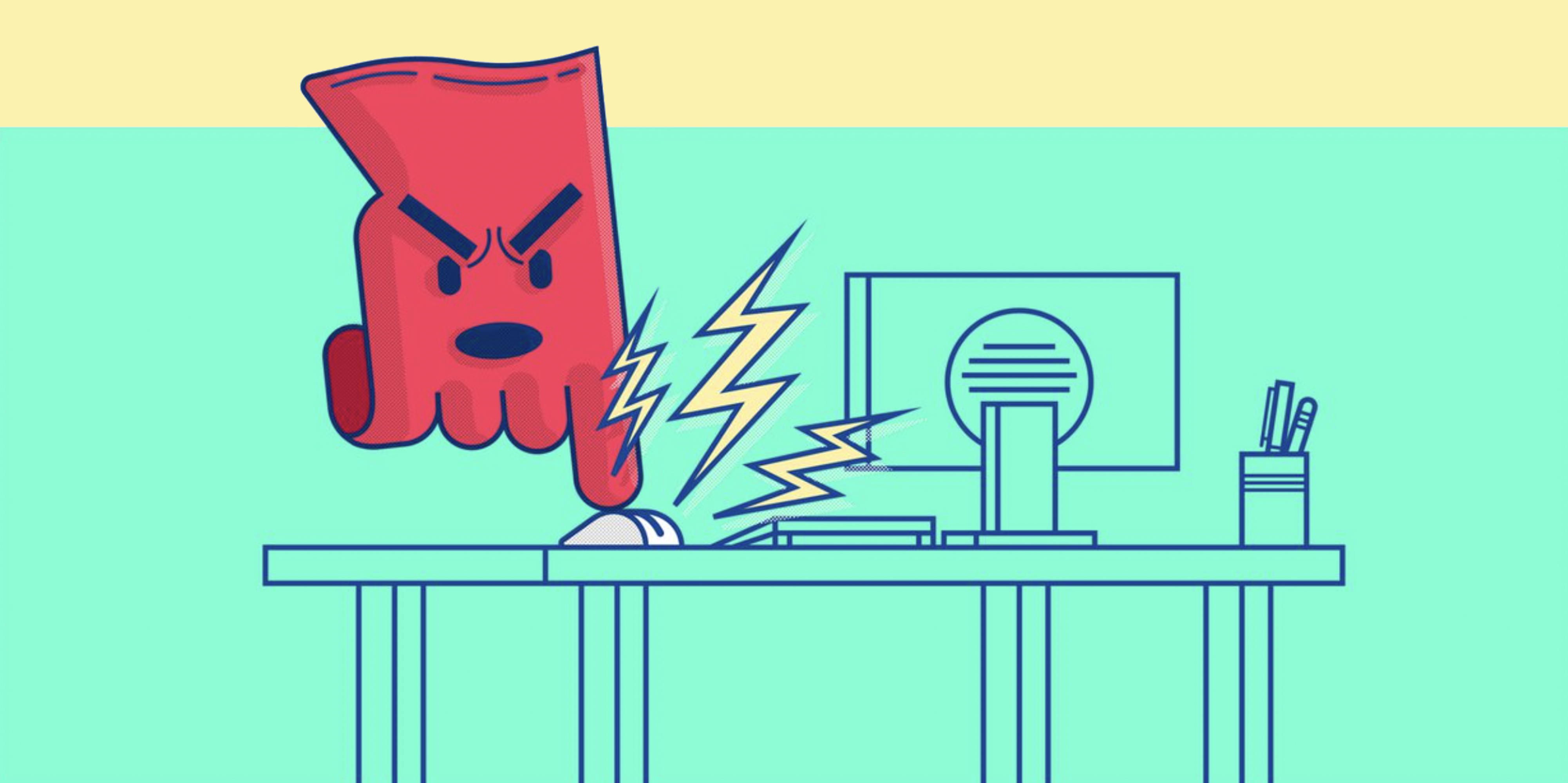
As a marketplace, the customer journey had to stay frictionless until booking confirmation. Hotjar data exposed a critical drop-off: users were "rage clicking" a non-interactive element at the final step, and bookings were being lost.
The culprit was a redundant choice. 95% of users had only one wallet but were forced to "select" it—a step that looked broken and blocked progress.
I removed the friction by defaulting to the single wallet. Now, users skip the selection entirely, while the multi-wallet picker remains only for the <5% who need it.
SOLUTION
Optimizing the user flow based on data.
RESULTS
0Rage Clicks
+14%Increase in Bookings
"The updated flow removed friction at the final step and delivered a measurable lift in bookings."
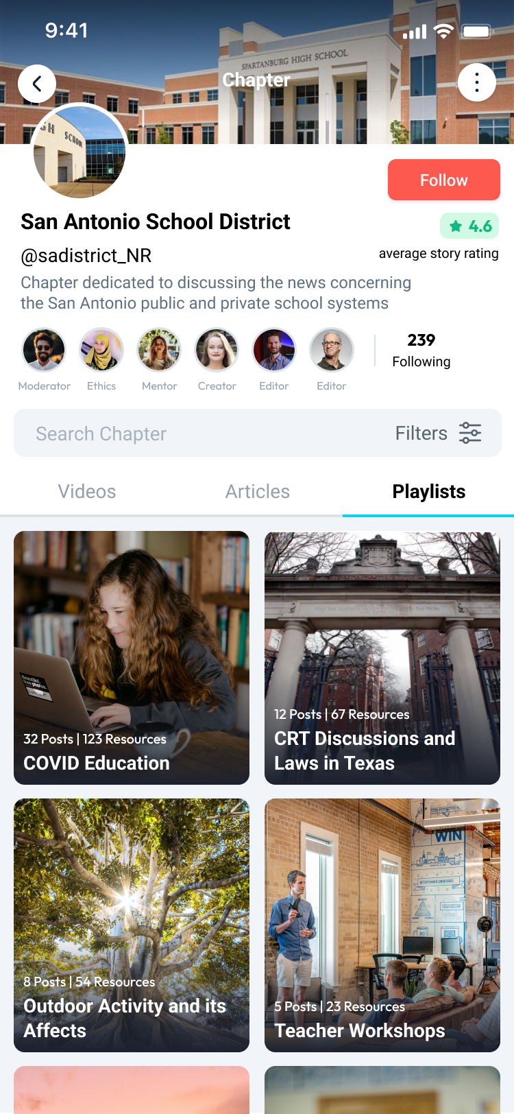
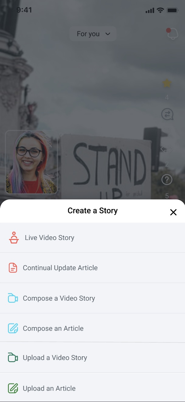
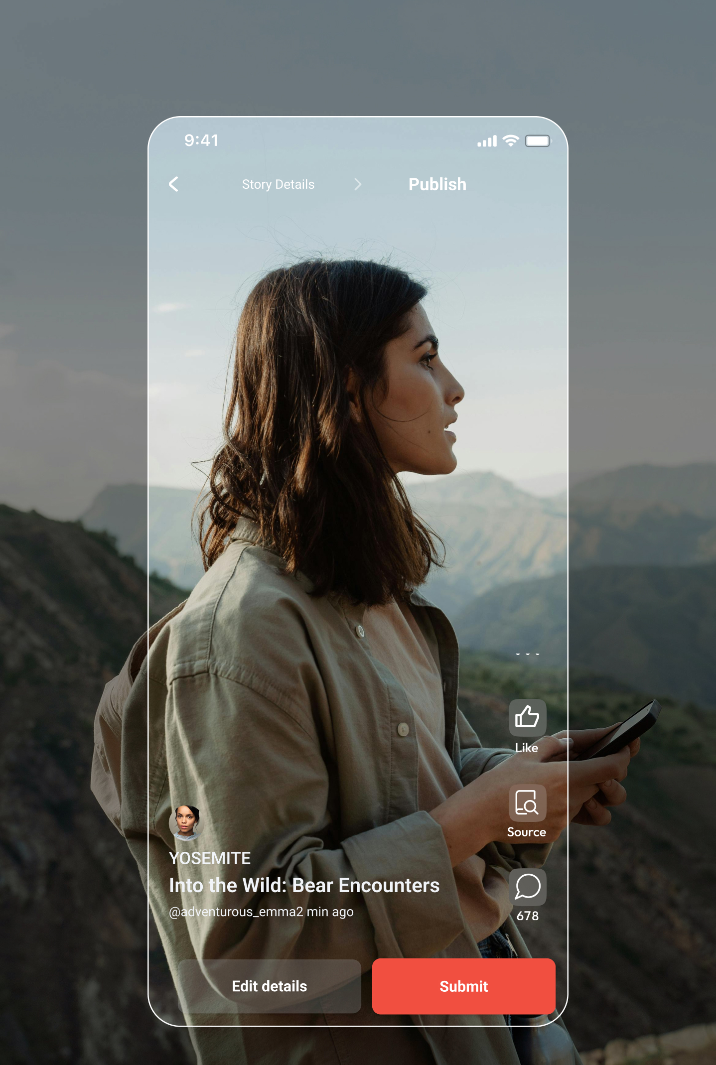
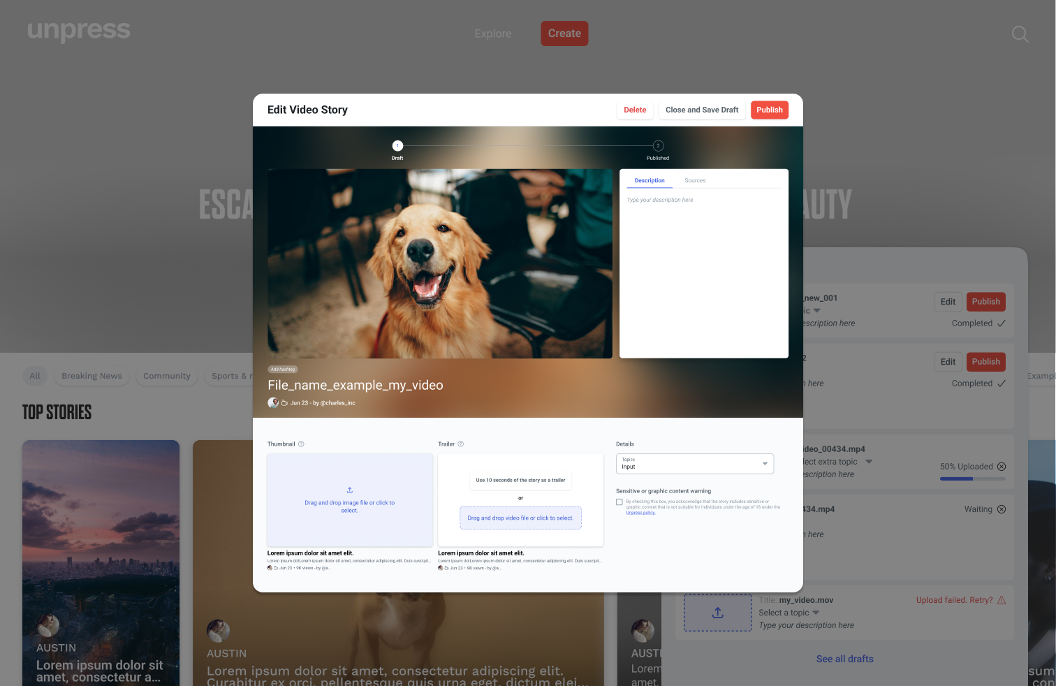
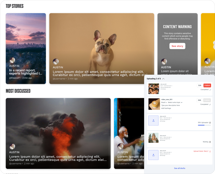
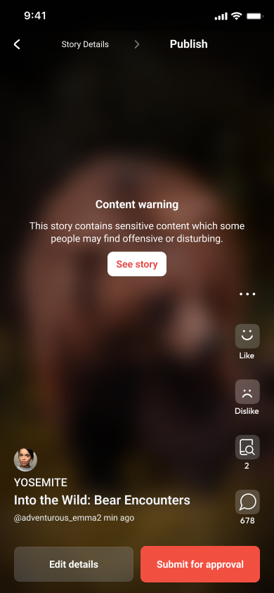
Case Study · Unpress
Consistent Video Experience
Role
Lead Designer
Team
2 Designers, CTO, CEO, PM
PROBLEM
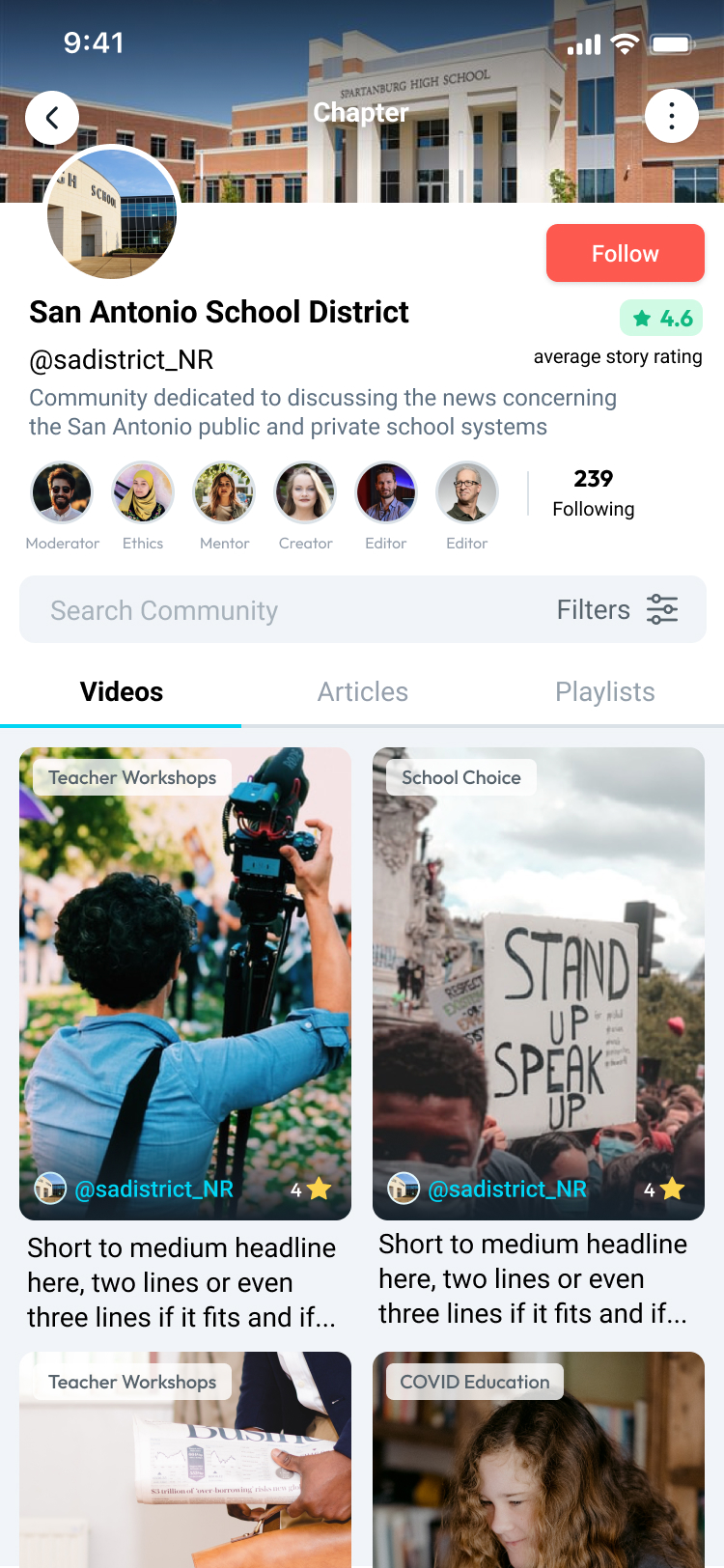
Unpress is an Austin-based platform for authentic journalism spearheaded by global media leaders from CNN, NBC, and Gawker Media, including former VPs and pioneers in video journalism. Its mission is to combat media polarization by rewarding credibility and authentic storytelling.
Some screens from the legacy platform before the redesign.
The key design challenges were:
TO DO
Reduce anti-patterns and establish a design system
tech debtDesign Bug
Support horizontal and portrait videos
new features
Enable the web platform on desktop and mobile
new features
Make news easier to browse
user feedback
Reduce visual clutter when watching stories
user feedback
Fix unclear visual communication
user feedback
SOLUTION
Design System
Figma files
flowchart TB
foundations["fa:fa-layer-group Core Library: Colors, Types, Styles, Icons, States, Brand"]
web["fa:fa-globe Web Components Library"]
app["fa:fa-mobile-screen-button App Components Library"]
web_mobile["fa:fa-mobile-screen Web Mobile: Portrait, Landscape"]
web_desktop["fa:fa-desktop Web Desktop: Responsive, monitor sizes..."]
app_ios["fab:fa-apple App iOS: Ipad, iPhone, Portrait, Landscape, ..."]
app_android["fab:fa-android App Android: Samsung, Motorola, Tablet, Portrait, Landscape..."]
testing_ideas["fa:fa-flask LAB: User testing, navigable prototype, ideas, presentations..."]
foundations --> web
foundations --> app
web --> web_mobile
web --> web_desktop
app --> app_ios
app --> app_android
web --> testing_ideas
app --> testing_ideas
classDef layer fill:#ffffff,stroke:#7b7770,color:#1f1e1a,stroke-width:1px;
class foundations,web,app,web_mobile,web_desktop,app_ios,app_android,testing_ideas layer;
This Figma structure made the system much easier to design with day to day, keeping production work consistent, organized and easier to scale while leaving room for exploration in a separate LAB. Once it was fully in place, team velocity doubled.
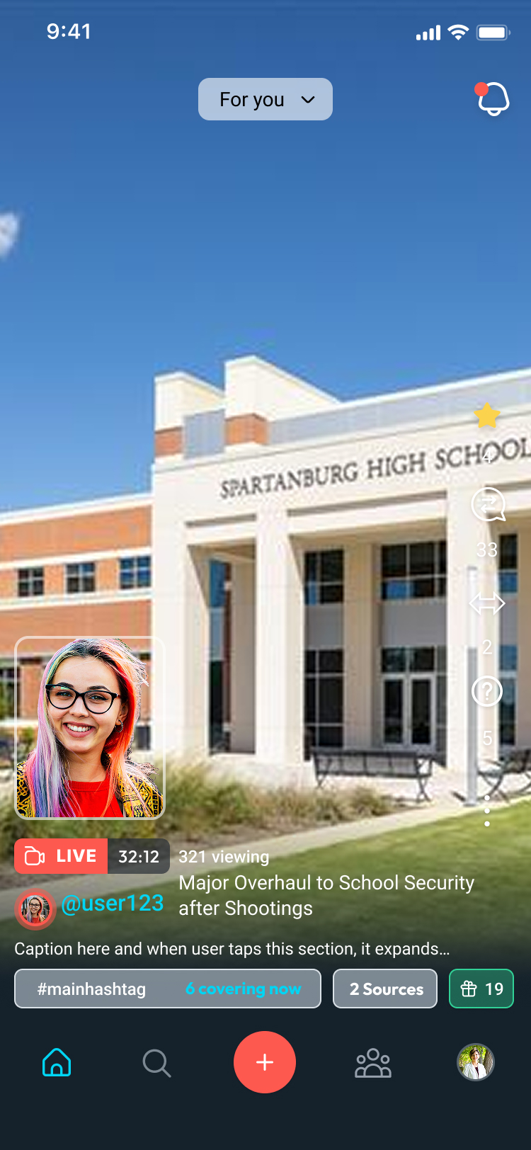
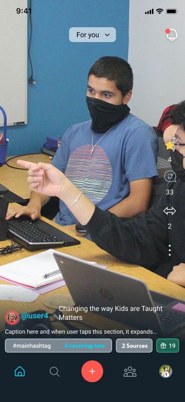
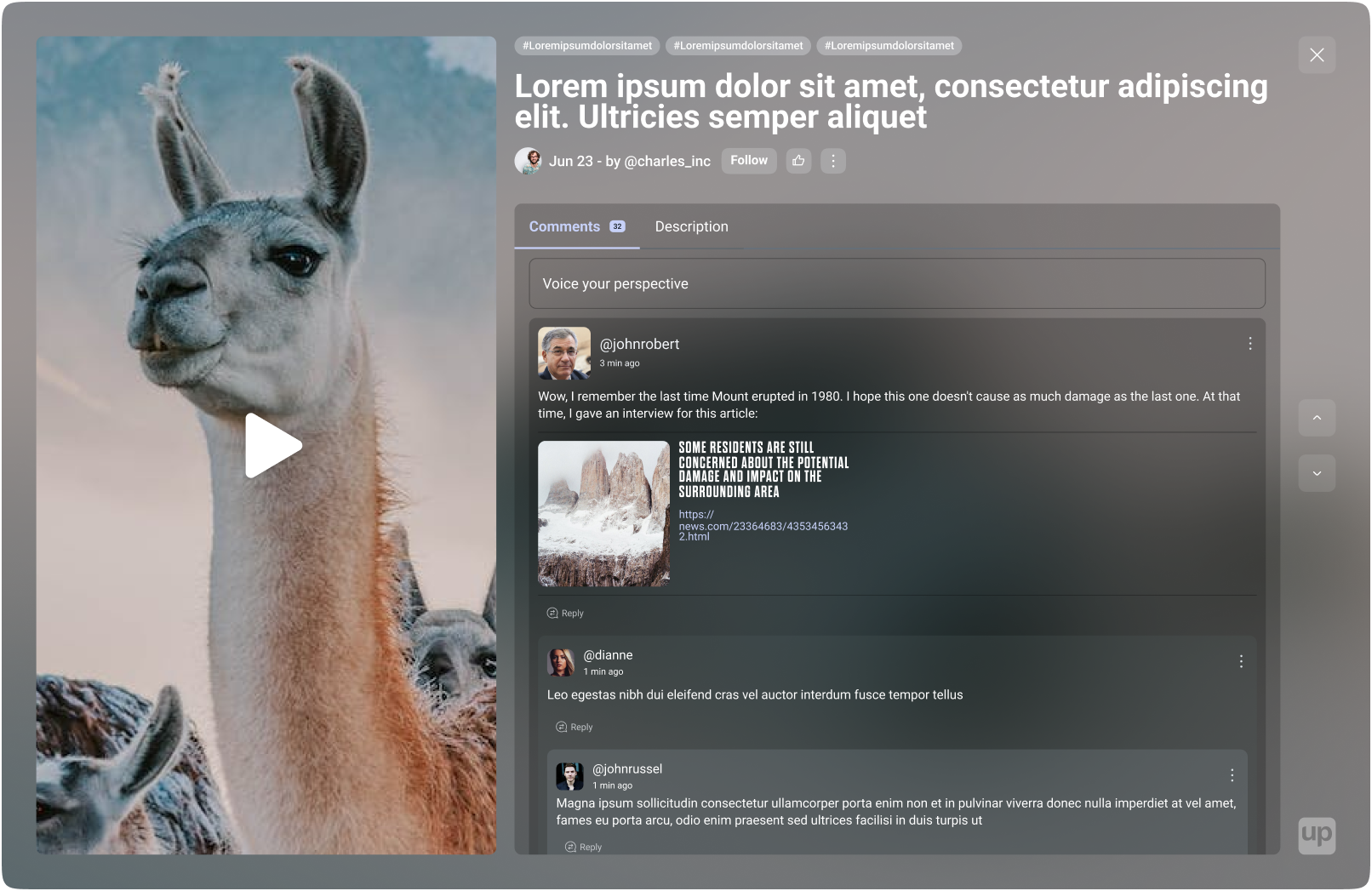
Dynamic layout
Most video platforms still split vertical and horizontal browsing. I created a dynamic layout that unifies both. Please test it below: switch devices, shuffle scenarios, change story position, and try to break it!
Grid + Carousel PlaygroundShuffle scenarios, switch devices, and test how 16:9 and 9:16 videos behave across layouts.
Carousel
Grid
Carousel
Grid
From there, I focused the browsing experience on two core components, Grid and Carousel, which could scale cleanly from the app to mobile web and desktop web.
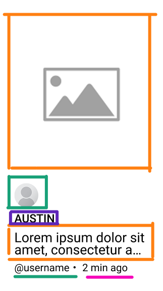
News card anatomy
The structure is directly related to the main questions of journalism:
What,
Where,
Who and
When.
This structure speeds up browsing news.
RESULTS
2xFaster development deliveries after Design System
100%Unified interface for vertical & horizontal reading
“I had the pleasure of working with Maycon on UI/UX, and I highly recommend him. He has a sharp eye for clean, modern visual design and a strong instinct for user-centered layout and flow. His ability to take feedback—not just accept it, but actively improve on it with thoughtful iteration—sets him apart.”
Modernized public services for citizens of Osasco, Brazil.
Problem
Describe the context, business, and product background for this case.
Describe the main challenge or problem that needed to be solved.
Solution
Describe the final solution and key features.
Results
XX%
Key metric
XX
Another metric
Add a client or stakeholder quote validating the outcome.
Case Study · CSAT
Non-deterministic CSAT
Role
Service Designer
Team
Backend Developer, Customer Success Manager (CSM)
PROBLEM
Founded in 2019, Materialize was accelerated by Endeavor Scale-Up and backed by investors to scale. It operated as a B2B startup where companies bought hour credits to book video calls, while payments, validations, ratings and dispute handling maintained trust and quality. In 2023, the company surpassed half a million bookings.
However, as the volume of sessions grew, maintaining visibility into that quality became a major challenge: our primary post-call feedback loop was broken.
“
CSAT response rates were too low: most users ignored the question.
To diagnose this issue raised by the CSM, I mapped the end-to-end feedback journey using a Service Blueprint.
09:41
MON 14
On a scale of 0 to 5, how satisfied were you with your session?
10:09
FRI 18
On a scale of 0 to 5, how satisfied were you with your session?
14:30
WED 16
On a scale of 0 to 5, how satisfied were you with your session?
Seller
Stay online and delivers work during session
Buyer
Receives CSAT survey: "On a scale of 0 to 5, how satisfied were you?"
Friction
Click/Taps Ignore or Answer — most ignore, some answer with external form.
Buyer
Receives targeted outreach for support or account growth
Line of Visibility
Frontstage (Visible to User)
Platform
Sends booking confirmation & reminders
Platform
Tracks session duration & logs hours
Platform
Survey appears on user’s device
Friction
Redirects to external form (Microsoft Forms)
CSM
Engages at-risk accounts & identifies upsell
Line of Internal Interaction
Backstage (Internal Processes)
Platform
Matches buyer ↔ seller & schedules
CSM
Monitors active accounts
Platform
Automation fires CSAT survey across channels
Gap
Score stored — low qualitative data
CSM
Manual triage for churn mitigation & expansion
Metric (Funnel conversion)
100%Confirmed bookings
92%Seller show-up
78%View CSAT
8%Response CSAT
1%CSM InterventionInsufficient data to act
Average time
24–48hours before
1hour
+0.5hours (post-call)
< 24hours
24-48hours
The problem wasn't reach, it was format and context: 78% of users saw the survey, but only 8% responded. Furthermore, less than 30% of those replies included qualitative feedback.
SOLUTION
Round 1: The Manual Prototype
Goal: Increase response rates by eliminating format friction.
“
What if we let customers answer however felt natural — and used AI to translate those replies into standard CSAT scores?
Traditional surveys rely on numeric scales because they are easy to measure — not because they offer good UX. The blueprint's "Response" column showed the drop-off was at the external form. This led to the core design decision: replace the form with natural in-channel replies.
Redesigned Flow
flowchart LR
subgraph Actors
buyer["Buyer"]
seller["Seller"]
cs["Customer Success"]
end
subgraph Discover
discover["Session closes"]
end
subgraph Learn
send["Sends open-ended prompt via WhatsApp"]
learn["Receives in-channel message"]
end
subgraph Use
reply["Replies naturally (text, audio, emoji)"]
ai["AI scores sentiment → CSAT"]
action["CSM acts with full context"]
end
subgraph Goal
goal["Goal: Feedback + Context"]
end
buyer --> discover
seller --> discover
cs --> discover
discover --> send
send --> learn
learn --> reply
reply --> ai
ai --> action
action --> goal
classDef layer fill:#ffffff,stroke:#7b7770,color:#1f1e1a,stroke-width:1px;
classDef improved fill:#ecfdf5,stroke:#10b981,stroke-width:2px,color:#065f46;
class buyer,seller,cs,discover,send,learn,action,goal layer;
class reply,ai improved;
Redesigned CSAT flow: removing the external form friction and replacing it with natural in-channel responses processed by AI.
Prototype: Instead of coding a backend immediately, we ran a "Wizard of Oz" test. We sent open-ended prompts via WhatsApp to a control group. Customers replied naturally with text, audio, emojis, or stickers.
Prototyping the data flow: Non-deterministic inputs to deterministic CSAT scores
Round 2: Validation & Automation
Goal: Verify if the AI-processed information was correct and reliable before scaling.
Validate & Test: To prove the AI could reliably score sentiment without human bias, we fed a dataset of historical text responses (with already verified ratings) from our database into our prompt. We compared the AI's inferred score against the actual historical score, proving the translation logic was highly accurate.
Build & Scale: Once validated, we leveraged n8n to automate the pipeline without taxing the core engineering team. This workflow listened to WhatsApp webhooks, routed audio for transcription, scored the raw text with our OpenAI prompt, and pushed the deterministic CSAT straight into existing dashboards.
RESULTS
3xResponse rate (8% → 24%)
100%Qualitative feedback (was <30%)
>90%AI Prompt Accuracy
“Maycon doesn’t just design screens; he designs solutions. His true strength lies in deconstructing a problem from the ground up before any UI work begins—and sometimes, his best solution is simply reducing screens and simplifying components.”